Changing the language in Word comment boxes

M$ Word does have a lot of power. It’s very successfully buried. Here’s a thing: the proofing language for the text is set separately from that for any comments you add to the text. It is I suppose a good thing to have separate control over these types of content. The language for comments is determined by the template for the file and may not be what you want. The link below goes to a very useful explanation that shows how to set it to be what you want. I include it here because I found it so useful. I don’t often reblog.

Source: Changing the language in Word comment boxes

Put simply, the language is hidden in the Comment Text style options, so you bring up the Styles pane, right click on the Comment Text style then find Modify → Format → Language. Now, this may only work on the current document. May need to check ‘all documents based on this template’ or similar.

Wordy.

Non-breaking en rule (en dash) in Microsoft Word… not really (or so I thought).

This is, in fact, doable, see this post.


Say you’ve got a number range. The proper way to format that is with an en rule (en dash), so it looks something like ‘4­–5’ whereas a hyphen would look like ‘4-5’. Now, you probably don’t want the number range to break across lines. That’s fine with a hyphen, since Ctrl-Shift-Hyphen gives a non-breaking hyphen (in Word). But you don’t want a hyphen you want an en rule. One option is to put in a non-breaking hyphen then make it twice as wide.

  • Highlight the non-breaking hyphen (and the hyphen alone, not any trailing/leading characters or spaces).
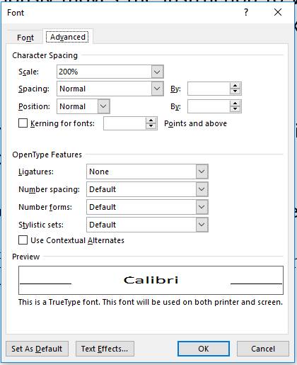
  • Right click on the hyphen and select the ‘Font…’ menu, then ‘Advanced’ (rule #1 in Microsoft products: Just about anything worth doing is considered ‘Advanced’).
  • Change the number in the ‘Scale’ box to be about 200%.
  • Exit from the menus.
  • Type an en rule in your document, alongside the stretched hyphen. (Ctrl-Keypad Minus.)
  • Compare.
  • Swear.
  • Use it anyway since it’s the most reasonable alternative. You may want to adjust the height; but will this highly manual fix work if font is then changed? No.
  • Watch while Word mysteriously moves the instruction to widen the characters to random places in the document so you end up with double width text in unexpected places.
  • Swear.
  • Learn LaTeX where all you need to type is \mbox{4–5}.
Dialog box in Microsoft Word for changing character size, position and spacing.
Stretch out the hyphen (or anything else) using the ‘Scale’ box. Gives fixed selections but can type in other values. Something between 175% and 225% usually works. Note: Can also be used to adjust the position if need be.

I have tried putting text in boxes, but the baseline is not maintained – it sits high. Character positions can be adjusted down, but then Word boxes clip the contents. Perhaps there is a better solution? I tried making it an equation, or using a minus character, but neither was really satisfactory. The minus does not sit at quite the right height, though it may well be the best solution, in truth. I’d like to hear about a better answer because, sadly, using LaTeX is not always viable.

Non-bresaking en rule in Word; results of stretching a hyphen.
Non-breaking en rule in Word; results of stretching a hyphen.

My Word.

Biotext

This week I started work at Biotext, a company that specialises in writing and editing complex scientific documents. It’s incredibly exciting — it’s the kind of opportunity that does not often come along. There’s a huge amount to learn, but that is part of the enjoyment.

As the name suggests, their focus has often been on biological material, though in the broadest sense — agriculture, environment, and medicine feature strongly. I’m hoping to increase the expertise in the physical sciences.

I looks like a chance to bring together science and writing, and it has come along at a time when I was on the lookout for a new job.

Good luck to me!


Bizz.

Word madness: Can’t save, won’t save. ‘A file error has occurred’

Word's useless error message. Notice the 'Was this information helpful'. What do you think?
Word’s useless error message. Notice the ‘Was this information helpful’. What do you think?


Got this error, and they had the temerity to ask me if it was helpful. Pricks. Anyway. Could not save to new name. Could not save to external media. Could not save elsewhere on C:. In short, could not save.

No.
No.

One bit of advice I have read is to wait till Word does an autosave, then kill Word using task manager. Then when Word is restarted it will give an option to rescue the file. Sounds dangerous to me. Waited but save did not come.

First thing I did was print to PDF with all track changes and everything visible so I would at least have a record of what the file looked like.

Then created a new blank file. Tested that it could be saved. Yes. And in the same folder as the original file. (I knew that should be OK since I printed to PDF into the same folder).

Went to file I wanted to rescue, with track changes visible and all comments visible. Ctrl-A, Ctrl-C
Went to new empty doc and pasted. Got text and comments but not the track changes information. Well, that is still useful as a backup.

Save.

Now, it should be possible to make a copy with track changes information.

https://word.tips.net/T001783_Pasting_Text_with_Track_Changes.html

Another handy way to copy the text is to use the spike. Word users are so familiar with using the Clipboard to cut, copy, and paste information that we often forget about the spike. This is an area of Word that acts like a secondary Clipboard, with some significant differences. (You can learn more about the spike in other issues of WordTips or in Word’s online Help.) To use the spike to copy and paste text with Track Changes markings intact, follow these steps:

  1. In the source document, select the text you want to copy.
  2. Press Ctrl+F3. The text is cut from the document and placed on the spike. (If you wanted to copy, not cut, then immediately press Ctrl+Z to undo the cut. The selected text still remains on the spike.)
  3. In the target document, place the insertion point where you want the text inserted.
  4. Make sure that Track Changes is turned off in the target document.
  5. Press Shift+Ctrl+F3 to clear the spike and insert the spike’s text into your document.

So I went to source document ant hit Ctrl-A, then Ctrl-F3.

Opened blank with same template, track changes turned off (it is by default I think).

Shift-Ctrl-F3

But does not save! The problems have come with it!

So that does not help.

Now, if I turn off track changes and accept all changes, I can save the document – so it is a bug somewhere in Word’s track changes code.
If the problem occurs again, can try the spike method with the different aspects of track changes turned on and off, to narrow it down.

So no satisfactory solution discovered. I do not know what change I put in that caused the issue, and it has never occurred before. So… I dunno. The above ideas are just partial solutions.


Solutions to problems nobody asks about.

nu and vee, I and l — design of physics books and modern fads for fonts

Rant.

As someone working in a technical field, I often feel like designers do not really appreciate the subtleties of notation and how to make it clear. In the title of this post, ‘I and l’ is upper case ‘eye’ and lower case ‘el’. Not that you can tell.

For example, because so many symbols are used, formulas can often contain symbols which might be mistaken for each other. The classic example is…ilb1

and here is the same formula using some sans serif fonts, using Microsoft Word…

ilb2

Now, this is not to criticise these fonts. They are just not designed for this job. It is the chooser of the font who is being a wee bit silly if these fonts are used in a mathematical document. An even trickier example is…

nuv

which I have produced in LaTeX, and the nu and vee are well-differentiated, but that is because the font was designed by someone (Knuth) with the express purpose of laying out mathematics.

If I was able to give advice to anyone out there designing a text with mathematics in it, it would be to look at the two letter/symbol pairs I have shown here, and make sure they can be told apart. If not, the font choice is a poor one and needs to be changed. And what is fashionable at the moment is irrelevant beside the need for clarity and the fight against ambiguity and lack of precision.


Rant over.

Brother Deluxe 700T

So I am trying out this old Brother Deluxe 700T manual typewriter. It is is nice condition, and seems to work perfectly well. The bell sounds dull and the ribbon is faded but does feed. The machine works well and it is my only machine with a ‘1’ key (instead of using ‘l’) and an exclamation mark (!). On the other hand, it feels sloppy and tinny compared with the Dora and especially the Hermes, which feels like it was machined from solid lump of steel where this feels more like it was riveted together from pressings. Good pressings, I suspect. It’s in great nick and set me back $20, which is pretty reasonable. I’ve put a two colour ribbon in it, since the other ones have black.

I can’t be bothered inserting pictures carefully, so here they all are:

Brother Deluxe 700T with it's top on. Beige beige beige.
Brother Deluxe 700T with it’s top on. Beige beige beige.


With the top off. Case in background. All plastic but all in good condition. Why is tab in red? Is it dangerous?


Some type from the Brother, man.
Text in two colours. The machine produces stuff that looks good on the page, though it feels flaky under the fingers while typing, as if bits are bending and flexing, but everything seems to end up in the right place when the typebar comes down.


My Brother from Nagoya.

Quick wipe with a bit of Jif on the casing, no cleaning of the machine itself required, and away it goes. The case is very plasticky, and looks quite flimsy, so I am quite impressed that it is so intact; I suspect it has not been used very much. No doubt being owned by me will see to it that the plastic lugs and springs and other vulnerable bits get broken. But in the meantime it gives me another unit to, well, put somewhere.

Nagoya B75635279, means was made Feb 1977. ‘JP-7’ model, under the hood.

Conclusion: The type is clear, with excellent contrast and readability. It has a paper stand, an eraser table, 1, 1.5, 2 line spacing, fixed but useful tab stops, a carriage lock (that I cannot get to work, though I can’t see anything wrong with it, so probably it is me), a ‘1’ and an exclamation mark (bang!) and an asterisk (*). I would say the selection of characters is probably superior to my other machines. It feels tinny but actually works very well and is lighter than my other machines (because uses a lot of fairly thin plastic). If results are important and ‘feel’ is not, it is an excellent machine. If ‘feel’ is as important as results, it does not match up with the Hermes. Brand new it would have been a lot cheaper than the Hermes (and it was cheaper second hand as well, though of course none of them cost much) and probably cheaper than the competing Olivetti, though, so I can see why there are so many Brother typewriters around.

This I think shows how clear and well-aligned the type is. The OCT routines I use work better with this than with the other machines I have.
This I think shows how clear and well-aligned the type is. The OCR routines I use work better with this than with the other machines I have (I will admit I thresholded the image in ImageJ because there was some show-through of type on the other side).

Nothing you needed to know, for sure.

Random Thoughts on Open Access Publishing.

There are a lot of problems with Open Access (OA) academic publishing. The biggest one is simple — if authors are paying to get their work out there, there is a financial incentive to publish everything that can be paid for. This has resulted in a vast explosion of completely crap online journals springing up, which effectively take money and post a pdf on a website and do little else. There are decent OA journals, but they virtually all come from established publishers. I have even used them myself. A new nadir was reached recently when it was pointed out that some journals are even charging people to be on their editorial staff, because such things presumably are seen as valuable on a CV or something. It is hideous to behold. Browsing old libraries and looking at the standards of papers in pre-internet era journals, it is on average much, much higher than now. I don’t think the good journals (say, those of the American Physical Society, IoP, IUCr, etc) have deteriorated, but the scientific literature is so diluted now.

The internet has enabled rapid search, but has also made it essential. New authors (and perhaps older ones too) must research the places they publish. I repeat; the best place to publish is the place you find the most useful papers.

BUT… I agree it is undesirable that publicly-funded science is published in subscriber-only journals. But how do we avoid the current problem that open access has become a synonym for rubbish?

The DOAJ website is something of a clearing house. They have a list of journals and a list of ones they have delisted. They link to places like http://thinkchecksubmit.org/, which can also help out. Having said that, DOAJ is funded by memberships and these include publishers, which is definitely a conflict of interest. It may be a necessary evil in getting the organisation running, but it is not a good look. A few quick non-exhaustive spot-checks suggest that the publishers on the DOAJ website are mostly not listed as dodgy at Beall’s list. So that’s a good thing.

DOAJ is meant to be a kind of ‘white list’ for open access. That’s a good idea. Ideally, though, it would be beneficial if labs and universities took more interest in the white list.  They (largely, though governments matter too) control the metrics by which researchers are measured, they produce the research and use the results.

I can imagine a parallel world where the OA journals are run by consortia of labs and universities. They could do it with minimal duplication of effort, host a network of mirrored servers, not charge a fee because they would be paying themselves anyway, base publication purely on merit, and probably save a lot of money that would otherwise be funnelled into the pockets of crappy OA journals.

Clearly this is impossible.

It would potentially send the current good publishers to the wall, it would be prey to things getting published because the people in the research labs have closer links to the publishers (though governance could probably deal with that, and even now publications have to have editors and boards and referees who may know the authors, so it’s not that different — there could be rules about submitting your paper to a non-local editor with non-local reviewers, which would be easier if the whole thing was done through a wide, multinational network such as that proposed). And it is against the modern trend of outsourcing everything (though the labs could get together and outsource the whole exercise in order to satisfy that modern fantasy).

What can I say? I have my doubts but I am not convinced it is unworkable. How something like http://arxiv.org/ would fold into it, I’m not sure. Anyway, just some thinking aloud.


If thinking’s allowed.


A little script to scan and OCR a bunch of pages

So this little script just uses scanimage, tesseract and vim to scan and process pages from my typewriter. It tries to produce sensible paragraphs, and outputs the results of multiple pages to a text file which can be read in and formatted using a word processor, such as LibreOffice.

It is an interactive script because I do not have a scanner fitted with a sheet feeder. To make it non-interactive, modify the scanimage line after reading the scanimage man page, and remove the line read Response. Nothing fancy, no error checking, no clean-up afterwards, no niceties. But it works pretty well, so far. If you want to use it, install any packages you need to to get scanimage, tesseract and vim to work, and cut and paste the below into a file in your path, and make the file executable.

cat type_ocr.sh
# /bin/bash
#
# type_ocr.sh v. 1.0
#
# Script to scan, ocr, process and concatenate pages, e.g. from a
# typewriter.
#
# D.J.Goossens, 14 July 2016. darren.goossens@gmail.com
#
# Start at 1001 so we can be (pretty!) sure all filenames have 4 digit
# numbers
#
# Create the output file.
echo This is type_ocr.sh v. 1.0
echo
echo Make sure you give it the output filename as a command line argument.
echo Ctrl-D escapes from the scanning, Ctrl-C quits elsewhere.
echo The resulting images and text files are not deleted.
echo They are of the form outXXXX.pnm and outXXXX.pnm.txt and
echo may be quite big.
echo
echo Hit Ctrl-C to exit now or Enter to continue.
read Response
echo 'Text file from type_ocr.sh v. 1.0' > $1
echo Processed `date` to $1 >> $1
echo 'Note: When it says "document 1001", treat it as document (page) 1'
scanimage --batch --batch-prompt --batch-start 1001 -p --mode=Gray --resolution=600
# Outputs are of the form out????.pnm. Loop over them
for f in out????.pnm;
do
tesseract $f $f
# The above produces out????.pnm.txt, which we can process,
# where first we replace double occurrences of newline with a placeholder
# string, then replace single occurrences with a space, then replace the
# placeholder with a return character (it is a trick of regular
# expressions that we search for \n (newline) but write \r (return) when
# we mess with the file).
vim -c "%s/\n\n/pLaCeHoLdErStRiNg/g" -c "wq" $f.txt
vim -c "%s/\n/ /g" -c "wq" $f.txt
vim -c "%s/pLaCeHoLdErStRiNg/\r/g" -c "wq" $f.txt
cat $f.txt >> $1
done
echo Try typing libreoffice $1 to see what you have got.
echo Setting paragraph formatting to indented and one and a
echo half space is a good start.

Your mileage may vary. Buyer beware. You get what you pay for. No guarantees implied or given. No warranty as far as possible. (Add here any other escape clauses you can think of.)

Because.